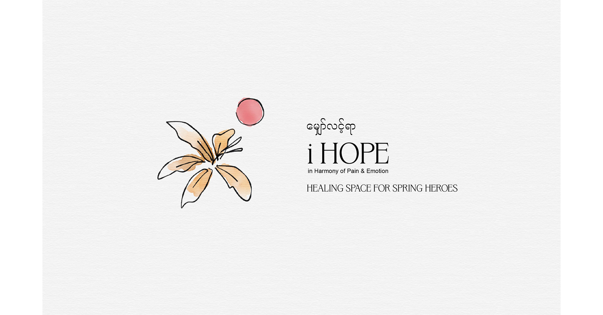
"I HOPE" — Healing Space for Spring Homes
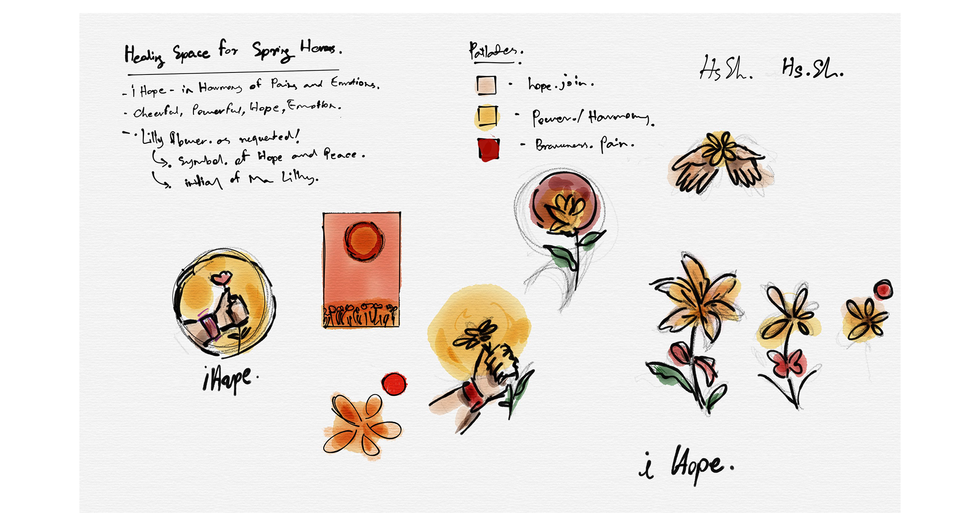
I’d love to share this meaningful and heartfelt sketch board created for a social engagement project titled "i HOPE." The idea was initiated when one of my respected sisters—deeply involved in volunteer work for refugees—asked me to help design a logo that could visually represent emotional healing and support. The project, "i HOPE – in Harmony of Pain & Emotion," is rooted in themes of resilience, empathy, and the gentle power of care.
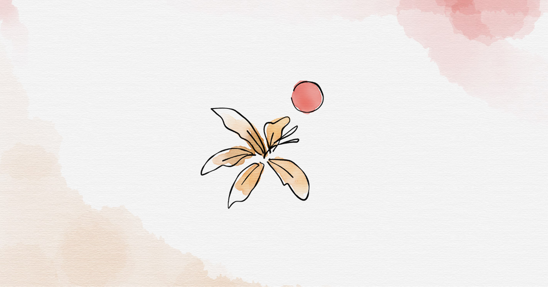
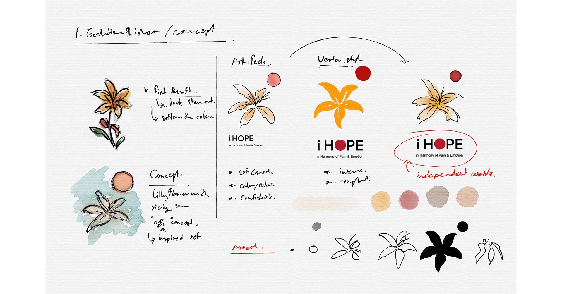
The design began with expressive hand-drawn sketches to reflect the emotional depth and sincerity of the cause. Central to the concept is the lily flower, a symbol of hope and peace, paired with a rising red sun—a powerful element inspired by the Spring Revolution in Myanmar, symbolizing courage, unity, and the collective longing for a better future. The warm palette blends beige for hope, yellow for harmony, and deep red for shared pain, capturing the emotional layers within the healing process.
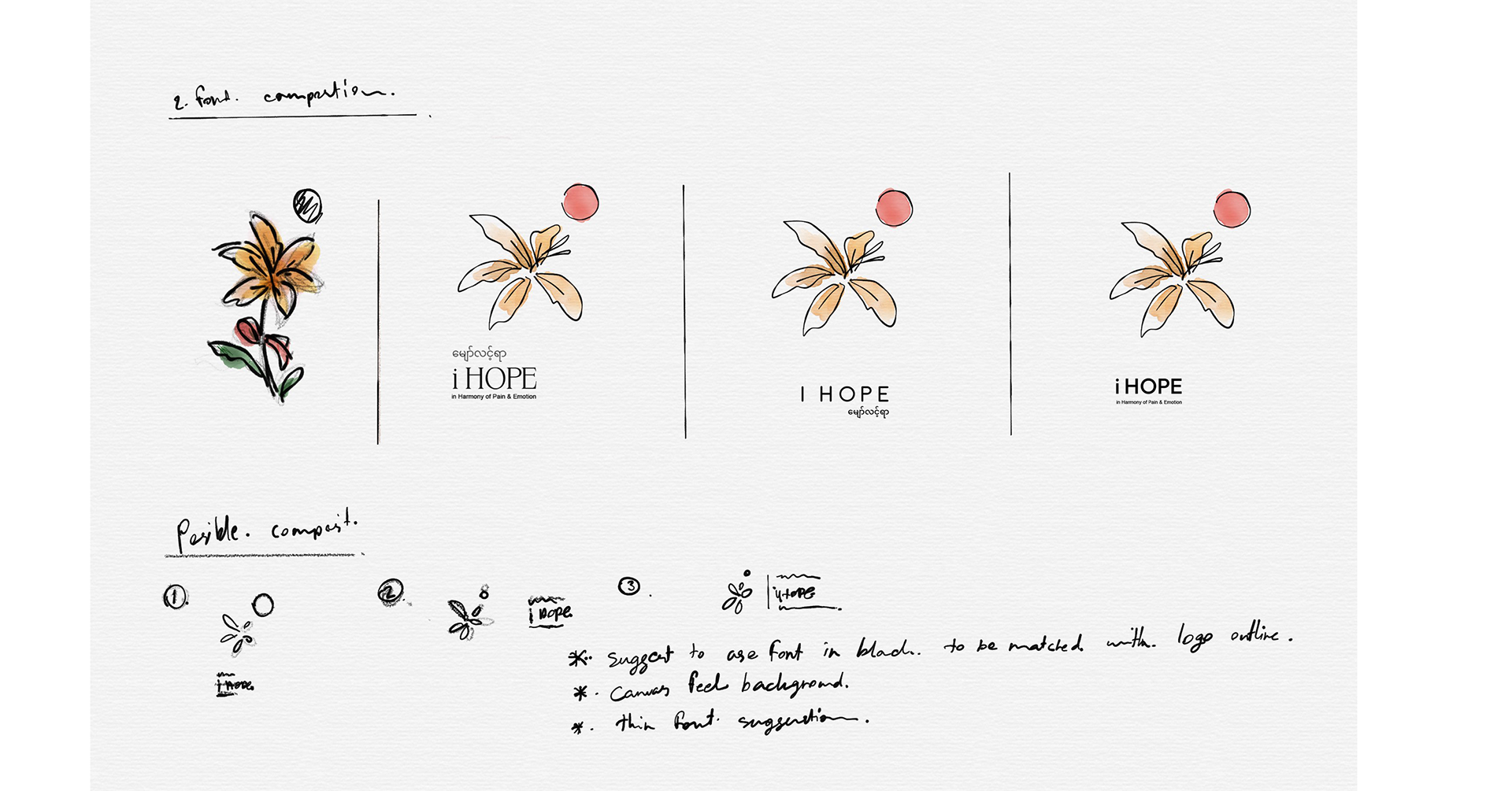
As the concept evolved, it transitioned from soft, artful forms to a clear and versatile vector logo—merging emotion with structure. More than just a design, this visual identity serves as a quiet tribute to the beauty of helping others. It shows how art can carry emotion, amplify solidarity, and offer comfort—even in the face of pain. Every line and color is a reminder of how creativity can become a voice of compassion, healing, and social connection.